What is a Bar Chart used for?
A bar or line chart can be your first choice if you wish to compare one thing to another. Line charts work better for portraying longitudinal data (data collected repeatedly over time, on a periodic, or rolling basis) than bar charts do for cross-sectional data (data acquired only once and showing the status of the data at that point in time).
In this type of visualisation, the categories being compared are shown on one axis of the chart, and a measured value is shown on the other. How each group performs in relation to the value is shown by the length of the bar. One negative is that when there are too many categories present, labeling and clarity can become difficult.
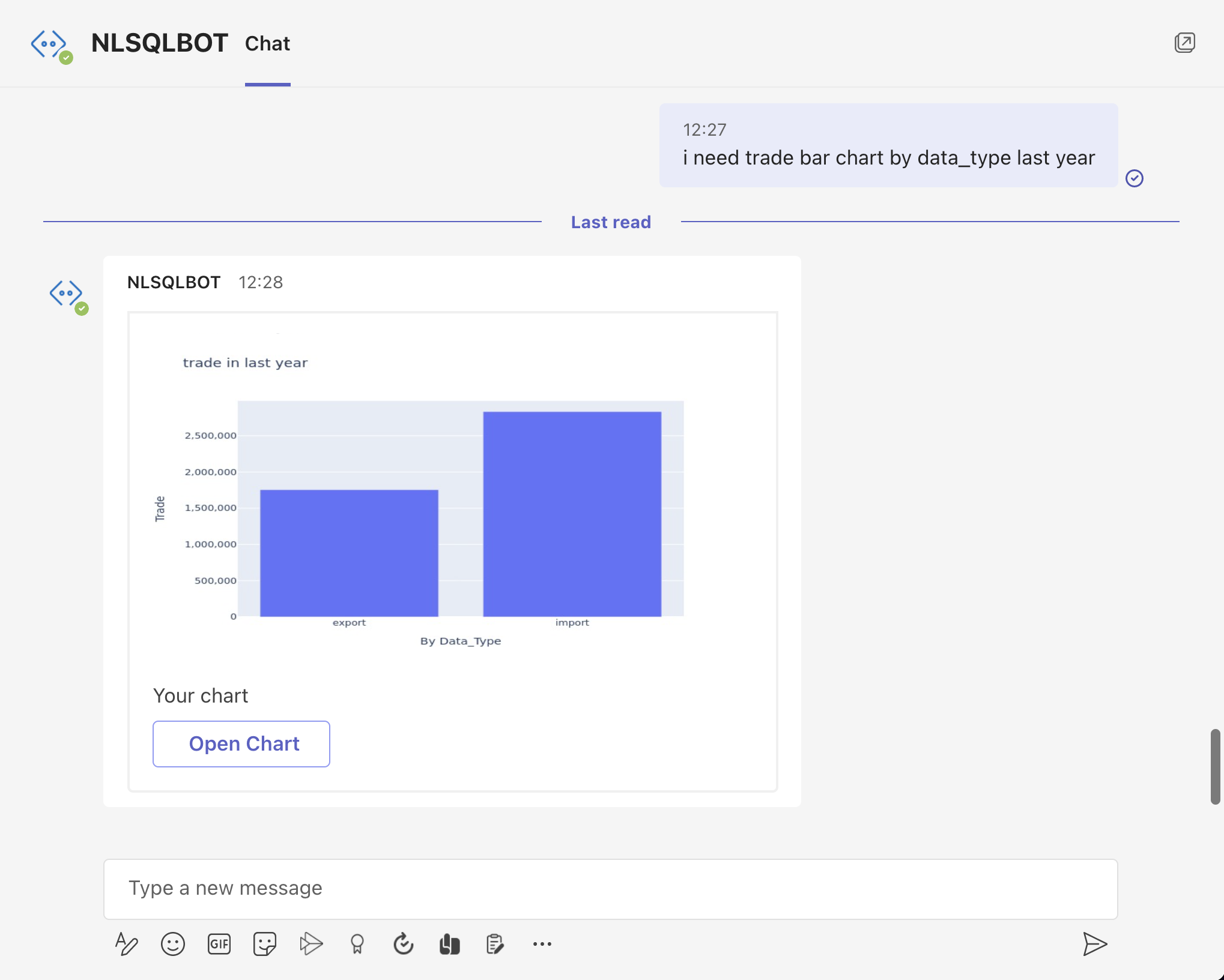
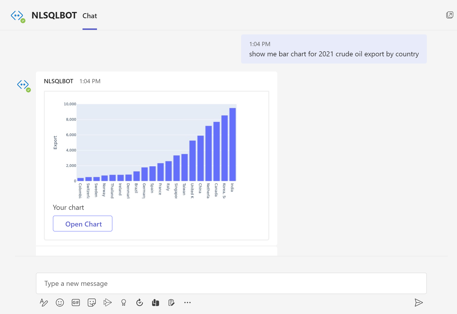
With NLSQL you can make the Line graph by asking a question in plain English (you can check how we did it on the pictures or start our 30 days free trial to try it by yourself with a link below)
More:
Make Your Bar Chart Now