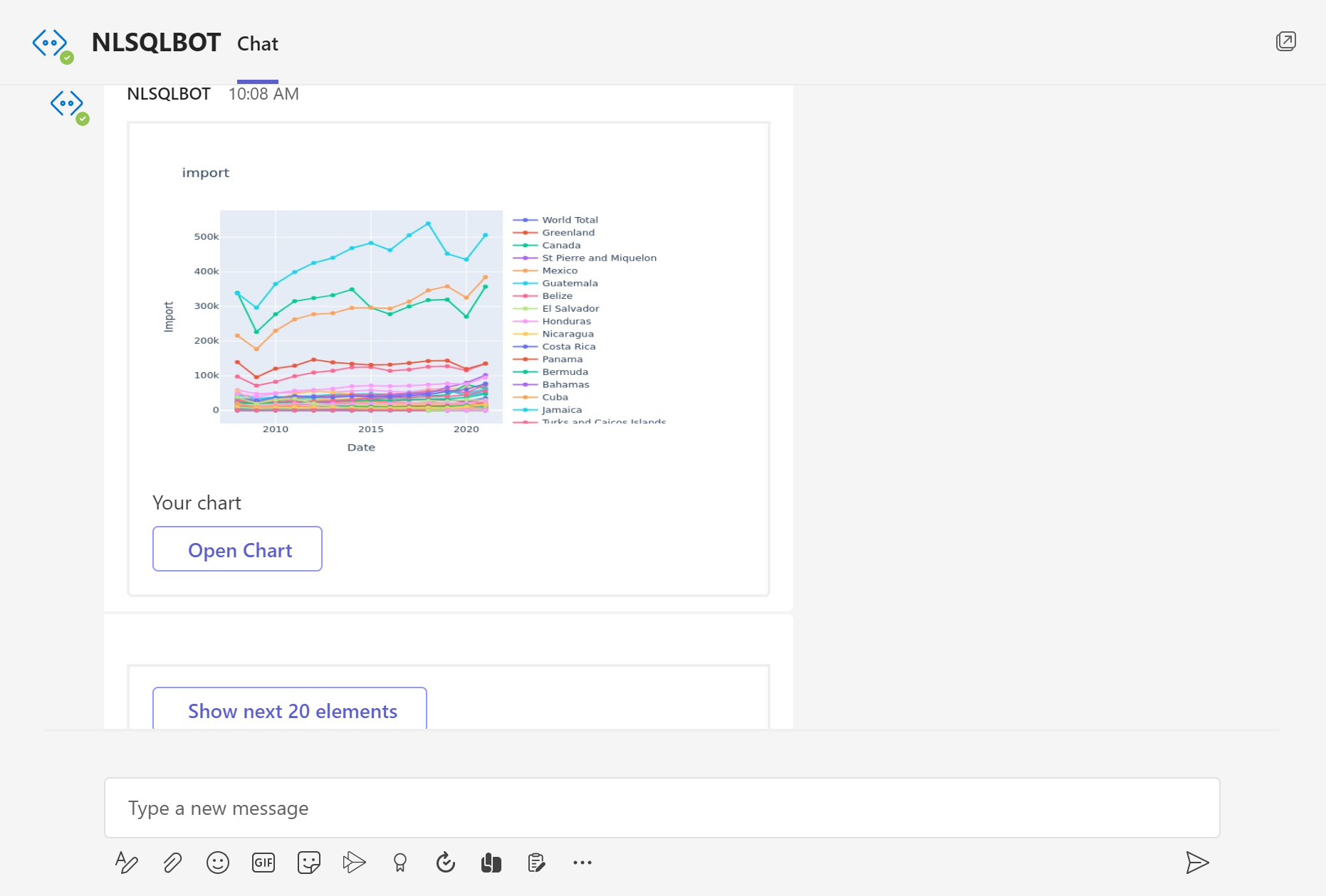
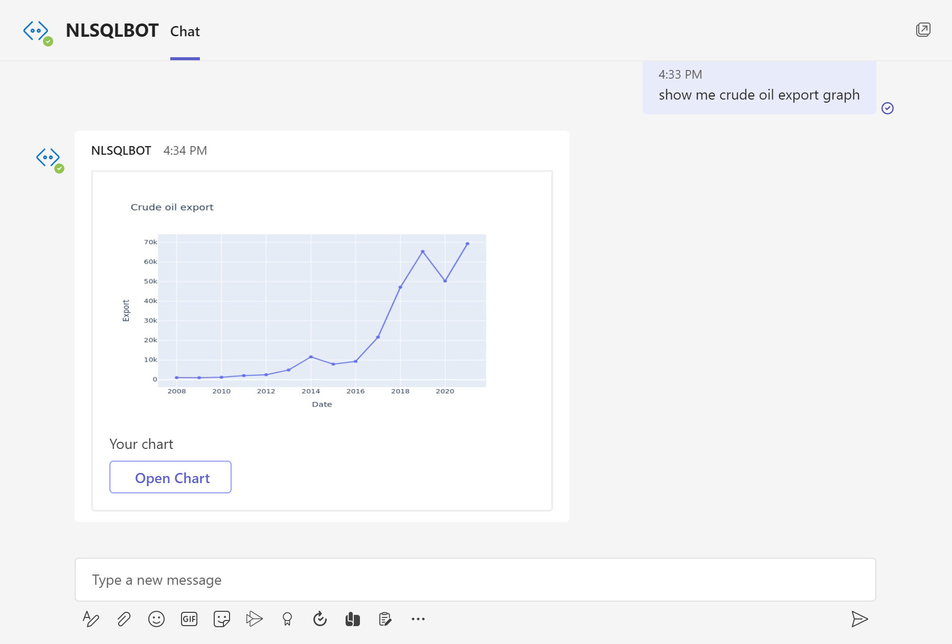
How to build line chart with plain English question?
Learning how to correctly display data may be the first step in utilising data analytics and data science to your advantage and the benefit of your company. By improving your abilities in common data visualisation techniques, you may take advantage of data-driven decision-making, which has numerous advantages including increased confidence and significant cost savings.
Depending on the kind of data you're working with and the story you're trying to tell with it, you'll use a different data visualization technique. You can improve your effectiveness in your role by using a variety of data visualization techniques. One of the most frequently used techniques is Line Graphs.
Line charts or graphs are useful for plotting continuous data and do not make sense for categorical data. Line graphs are often used to plot time. Line graphs are also useful for comparing multiple lines or trends. It illustrates how values relate to each other.
With NLSQL you can make the Line graph by asking a question in plain English (you can check how we did it on the pictures or start our 30 days free trial to try it by yourself with a link below)
More:
Make Your Line Chart Now