What are decision support systems?
An interactive information system called a Decision Support System (DSS) analyses enormous amounts of data to help guide business decisions.
A DSS supports the management, operations, and planning levels of an organisation in making better decisions by evaluating the impact of uncertainties and the considerations involved to make one choice over another.
To assist users in making decisions, a DSS uses a variety of raw data, papers, personal knowledge, and/or business models. Relational data sources, cubes, data warehouses, electronic health records (EHRs), income estimates, sales projections, and other sources may all be utilised by a DSS.
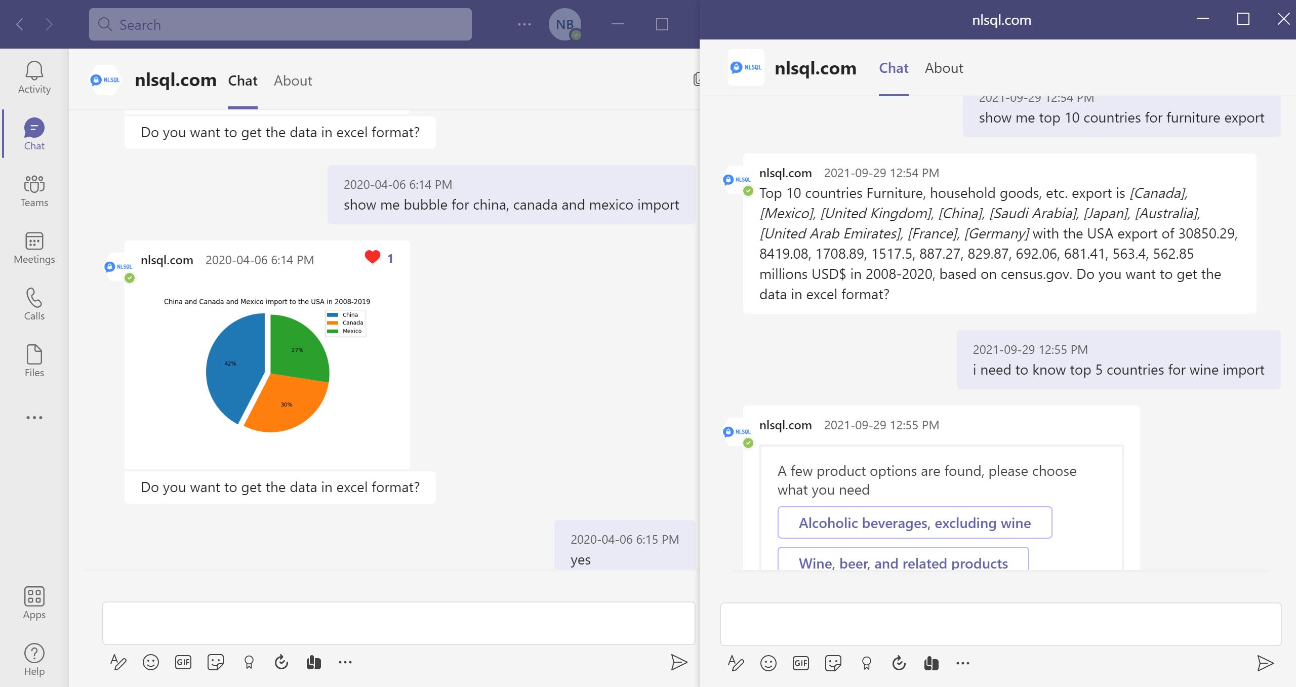
Decision Support Systems consist of three key components: the database, software system, and user interface. The size of the DSS database will vary based on need, from a small, standalone system to a large data warehouse. Microsoft Teams or other user interfaces allow users to interact and view analytics results.
Decision support systems (DSS) …

How to Enable BI Self-Service Analytics for your Company?
We assume managers at all organisation levels are key business decision-makers. But when managers hear about big data and analytics, what do they think? Do they comprehend how these technologies can be applied to decision-making? To take advantage of the capabilities brought by these varied mindsets, it is crucial to comprehend the distinctions between technical and non-technical employees. The gap caused by disparities between technologists and managers mindsets and education.
Due to their varied backgrounds, experiences, and training, managers and data professionals have different mindsets—different approaches to comprehending and solving problems. To take advantage of the capabilities brought by these varied mindsets, it is crucial to comprehend the distinctions between them. Thinking at these distinctions in terms of computational knowledge and contextual knowledge is one way to approach the topic. High degrees of computational knowledge are typically possessed by data professionals who specialise in the collection, analysis, and interpretation of …
More:
Create Your Self-Service Analytics tool for your Company



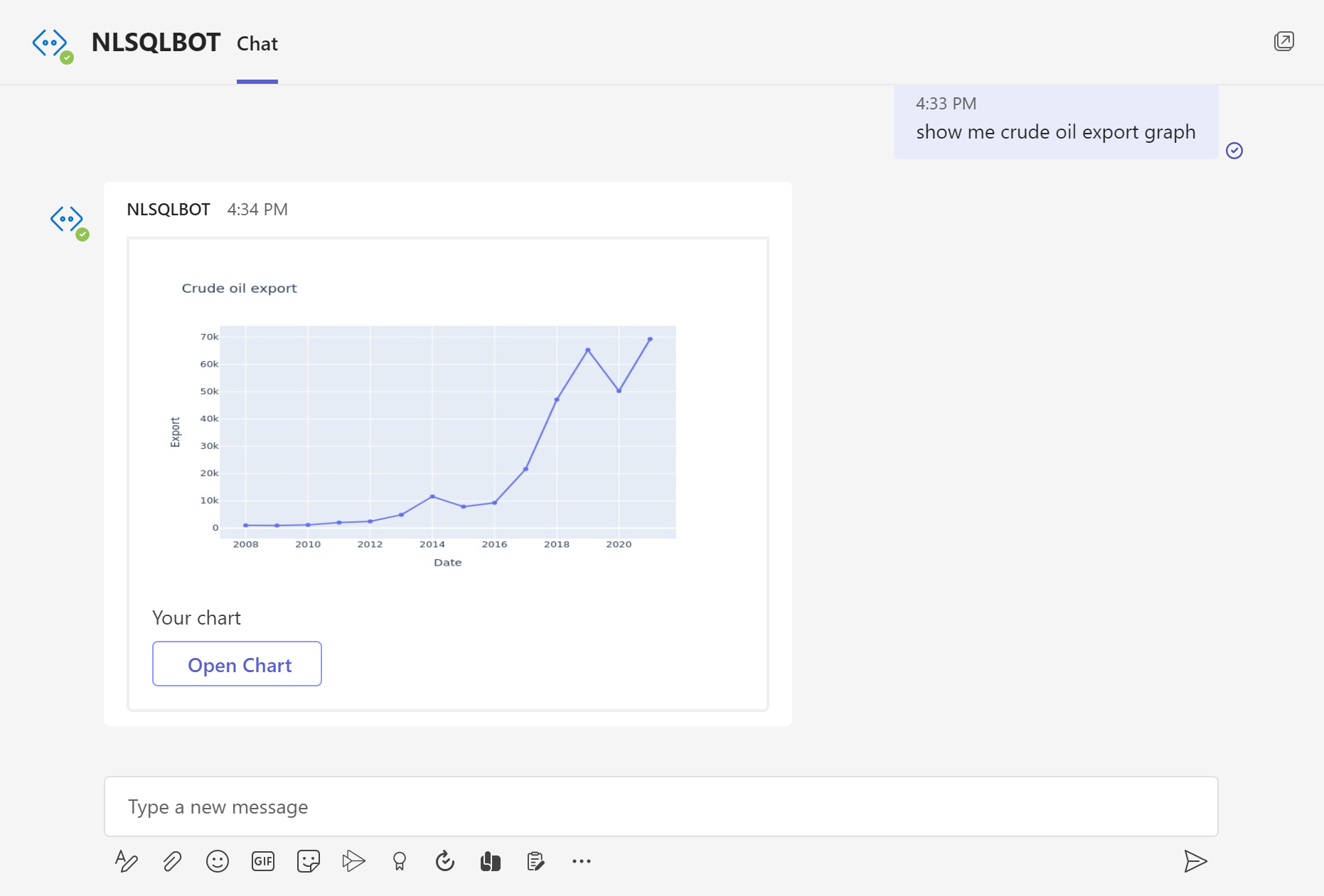
How to build line chart with plain English question?
Learning how to correctly display data may be the first step in utilising data analytics and data science to your advantage and the benefit of your company. By improving your abilities in common data visualisation techniques, you may take advantage of data-driven decision-making, which has numerous advantages including increased confidence and significant cost savings.
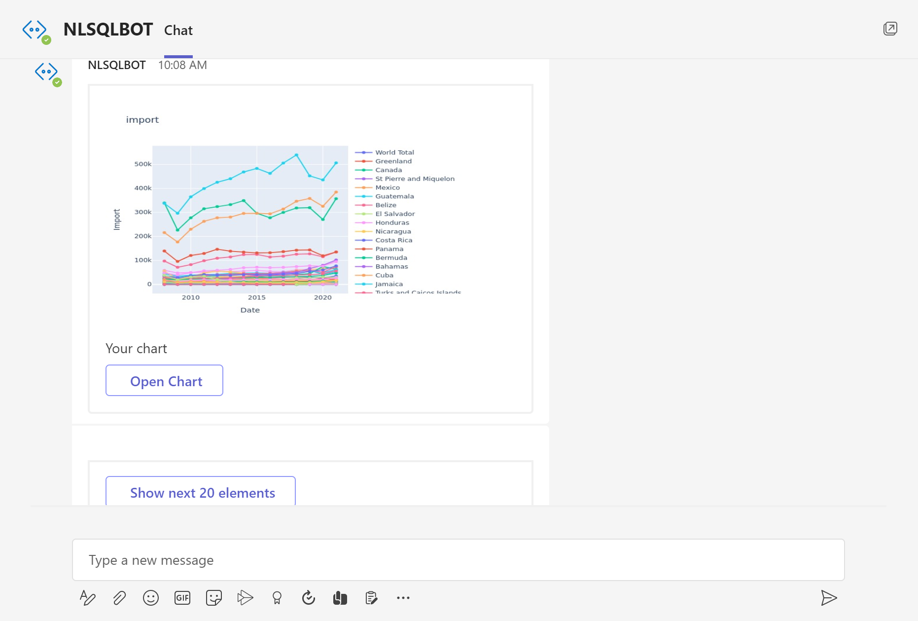
Depending on the kind of data you're working with and the story you're trying to tell with it, you'll use a different data visualization technique. You can improve your effectiveness in your role by using a variety of data visualization techniques. One of the most frequently used techniques is Line Graphs.
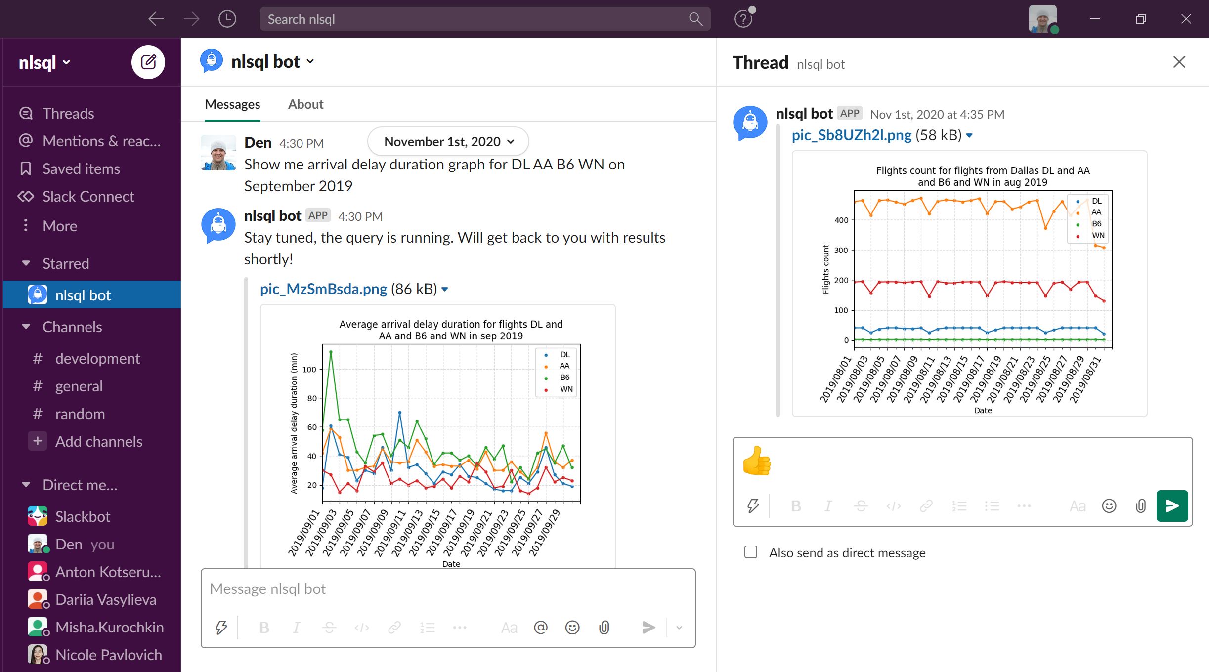
Line charts or graphs are useful for plotting continuous data and do not make sense for categorical data. Line graphs are often used to plot time. Line graphs are also useful for comparing multiple lines or trends. It illustrates how values relate to each other. …
More:
Make Your Line Chart Now
What are Choropleth Maps used for?
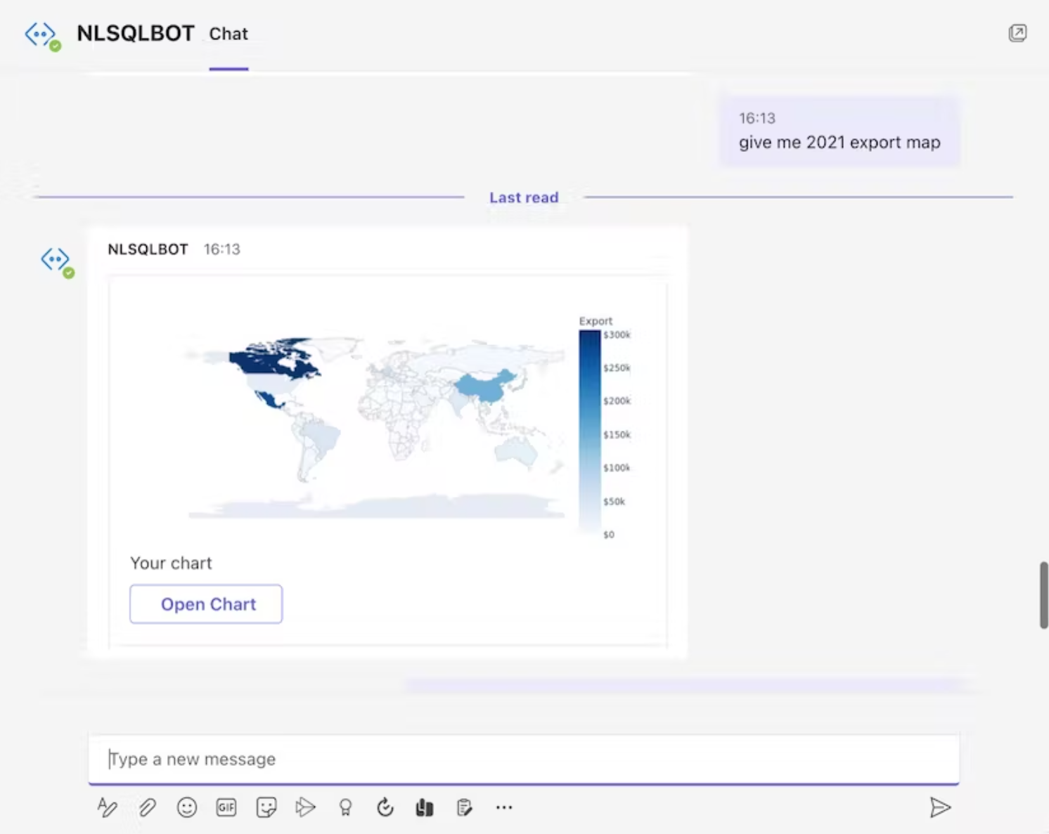
A choropleth map represents numerical values over geographical areas by using color, shading, and other patterns. To distinguish between high and low values, these representations use a progression of color (or shading) on a spectrum.
Viewers can observe how a variable change from one region to the next using choropleth maps. The fact that the colors represent a range of values makes it difficult to access the precise numerical values, which could be a drawback to this style of display. However, you may add interactivity to your map using natural language question to NLSQL bot so that you can get the precise values.
With NLSQL you can create the Choropleth Maps by asking a question in plain English (you can check how we did it on the pictures or start our 30 days free trial to try it on your data by yourself with a link below)
What is a Bar Chart used for?
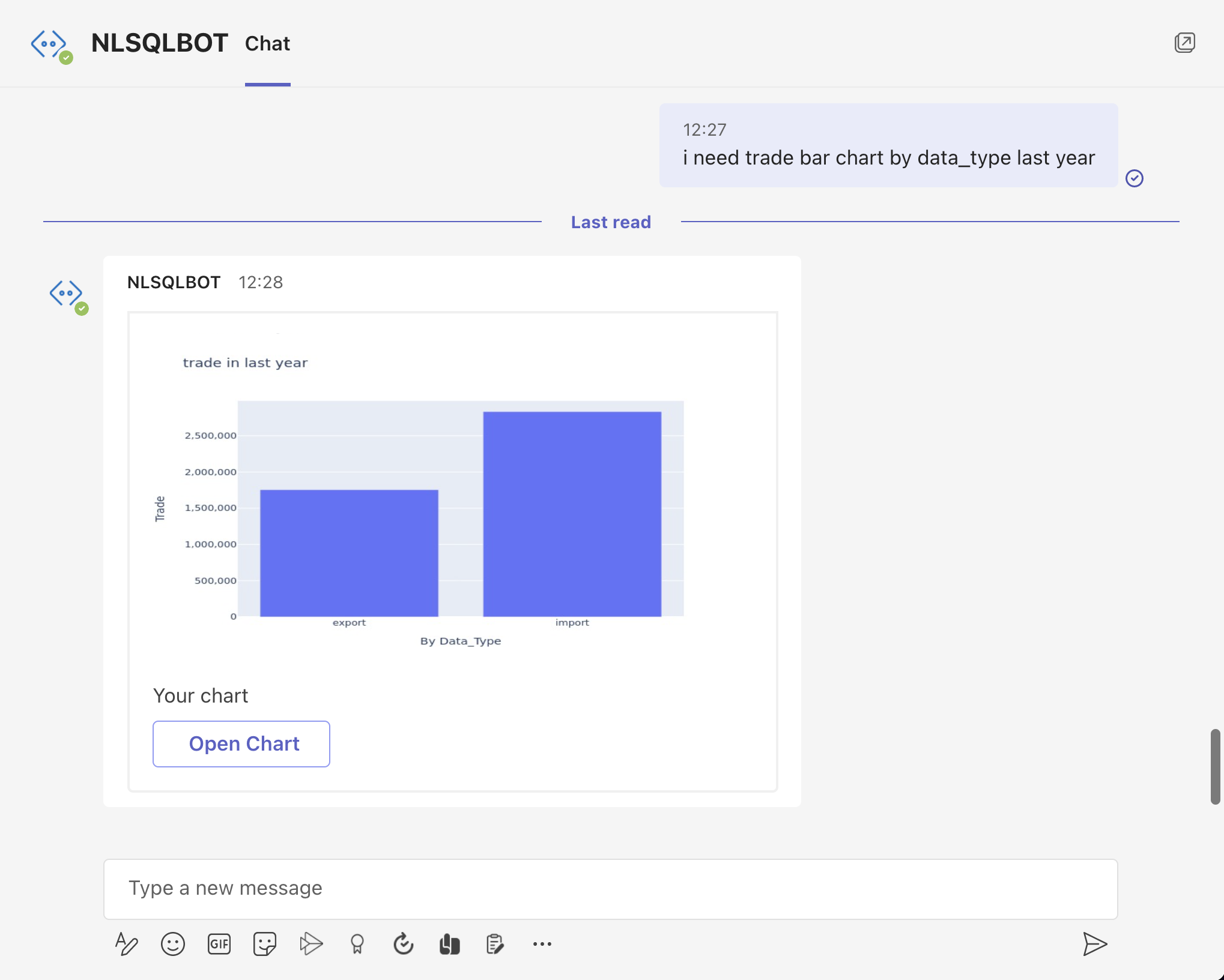
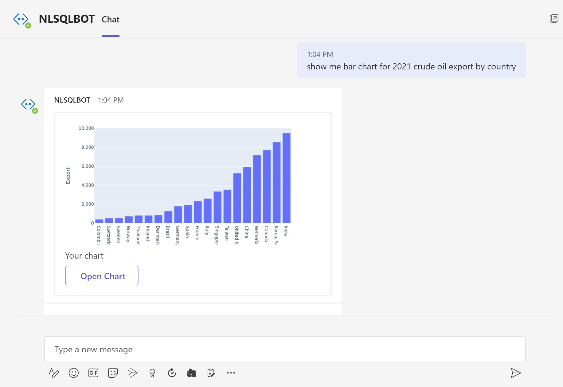
A bar or line chart can be your first choice if you wish to compare one thing to another. Line charts work better for portraying longitudinal data (data collected repeatedly over time, on a periodic, or rolling basis) than bar charts do for cross-sectional data (data acquired only once and showing the status of the data at that point in time).
In this type of visualisation, the categories being compared are shown on one axis of the chart, and a measured value is shown on the other. How each group performs in relation to the value is shown by the length of the bar. One negative is that when there are too many categories present, labeling and clarity can become difficult.
With NLSQL you can make the Line graph by asking a question in plain English (you can check how we did it on the pictures or start our 30 …
More:
Make Your Bar Chart Now